> ## Documentation Index
> Fetch the complete documentation index at: https://arivu.mintlify.site/llms.txt
> Use this file to discover all available pages before exploring further.
# Manual Charts
> Create charts manually by selecting tables and mapping axes.
If you know exactly what data you want to visualize, you can build a chart manually from within your dashboard.
## Supported Capabilities
Currently, manual charts support **single-table visualizations**. This means you select one table from your database and map its columns to the chart's axes. (Multi-table joins are not currently supported in the manual builder; for complex queries, use [Chat Charts](./chat-charts.mdx)).
## Creating a Manual Chart
Navigate to the Dashboards tab in your database workspace and click on the dashboard you want to edit.
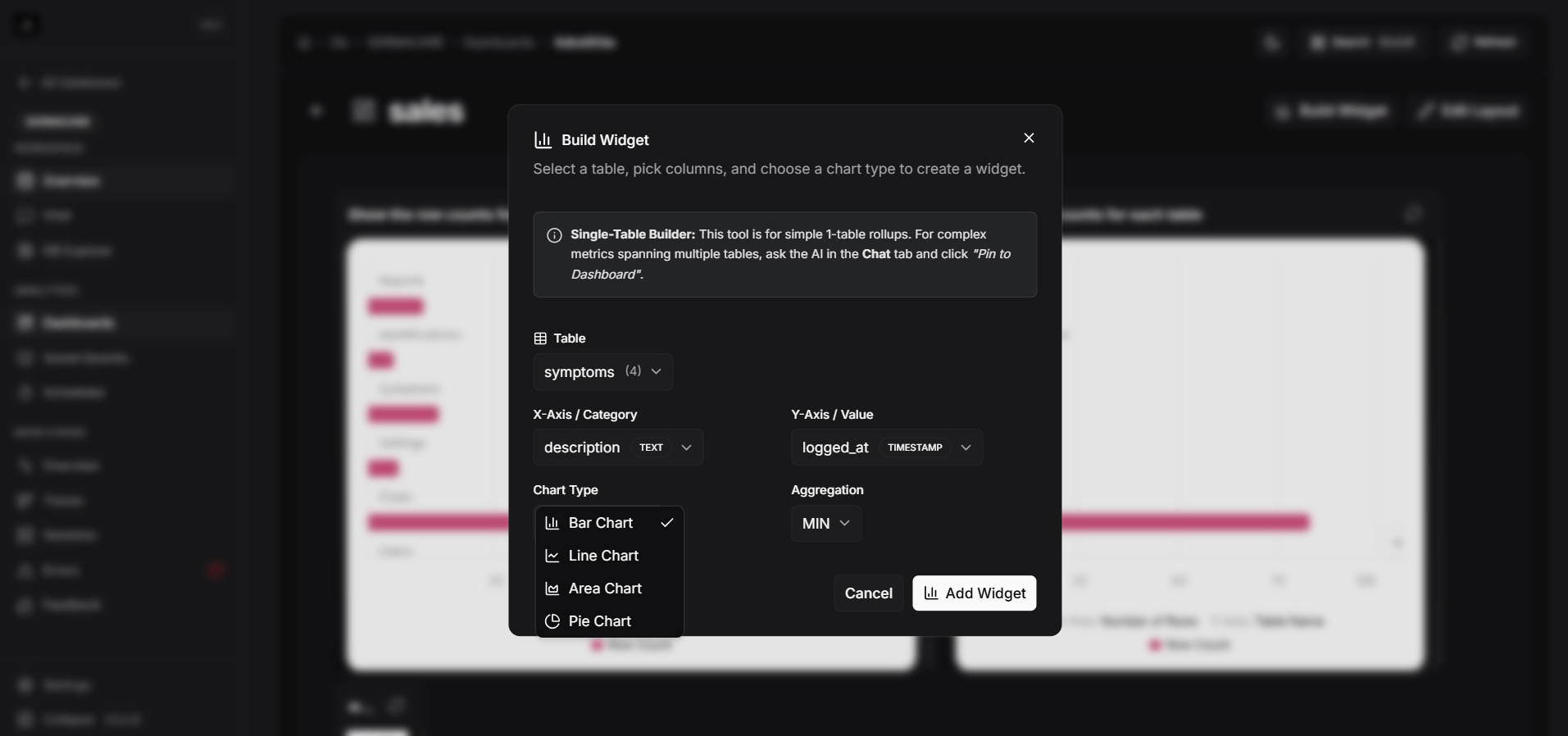
Click the **Add Widget** or **New Chart** button on the dashboard interface.
Choose the specific database table you want to visualize.
Map the columns from your selected table to the chart dimensions:
* **X-Axis**: Typically a category, date, or identifier.
* **Y-Axis**: The numerical value or metric you want to measure.
Click create. The chart will appear on your dashboard where you can drag to reposition or resize it to fit your layout neatly.