
Supported Capabilities
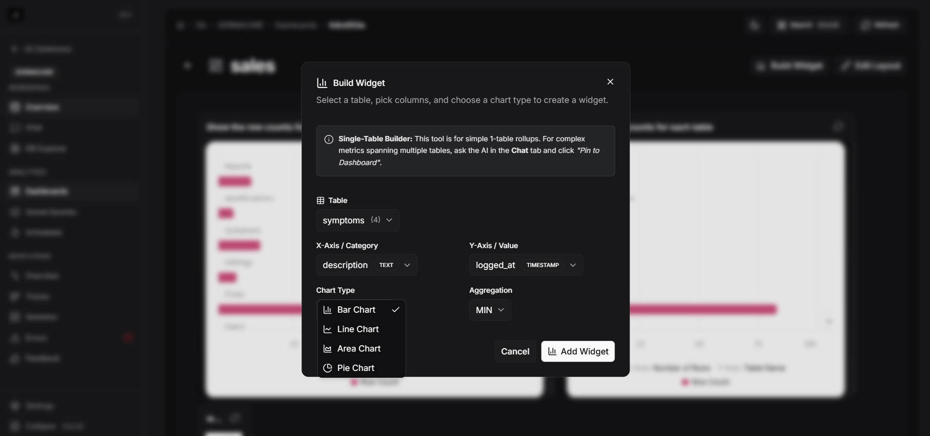
Currently, manual charts support single-table visualizations. This means you select one table from your database and map its columns to the chart’s axes. (Multi-table joins are not currently supported in the manual builder; for complex queries, use Chat Charts).Creating a Manual Chart
1
Open your Dashboard
Navigate to the Dashboards tab in your database workspace and click on the dashboard you want to edit.
2
Add a Widget
Click the Add Widget or New Chart button on the dashboard interface.
3
Select Data Source
Choose the specific database table you want to visualize.
4
Configure Axes
Map the columns from your selected table to the chart dimensions:
- X-Axis: Typically a category, date, or identifier.
- Y-Axis: The numerical value or metric you want to measure.
5
Save and Arrange
Click create. The chart will appear on your dashboard where you can drag to reposition or resize it to fit your layout neatly.