What is a Dashboard?
Dashboards in Arivu are customizable visual interfaces that aggregate charts and metrics. Because Arivu operates on a Workspace model, dashboards are scoped to a specific database alias, allowing you to build tailored views for each data source. In Arivu, creating a dashboard is the first step. Once a dashboard is created, you populate it with charts.Database Scoped
Dashboards belong to specific database workspaces, keeping metrics isolated and secure.
Customizable Layout
Drag, drop, and resize charts neatly on a grid to match your workflow.
The Workflow
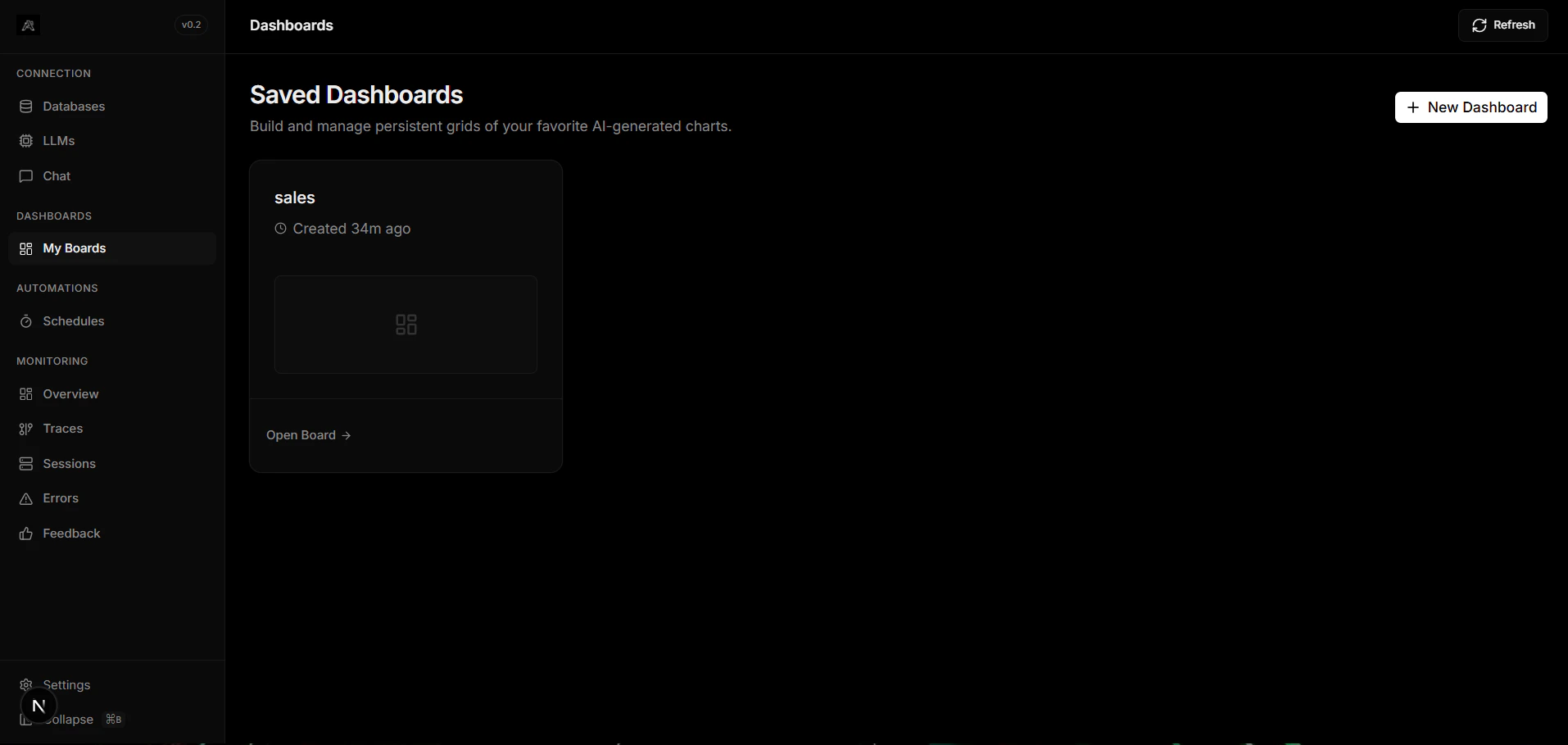
To build your visual analytics, follow this simple two-step process:Create a Dashboard
Navigate to the Dashboards section inside your database workspace and click Create Dashboard. Give it a descriptive name.
Pro tip: You can rearrange and resize charts at any time by dragging them around on the dashboard canvas. The layout saves automatically.
Next Steps
Learn how to populate your dashboards using our supported methods:Manual Charts
Create per-table charts manually by configuring columns, X, and Y axes.
Chat Charts
Pin AI-generated charts directly from the Chat interface.